💻 코드공방
onChange 시에 바로바로 validation 해주는 input 만들기
Cheri
2021. 11. 3. 15:00
보통 검증할 때 material + formik 조합으로 많이 사용하는데, 기존 formik은 무언가 버튼을 눌러서 submit 요청을 보내야 그 밑에 helperText가 뜨는 구조였다.
하지만, 내가 원하는 건 onChange 시에 바로바로 검증을 하여 helperText가 뜨는 구조를 원했다.
그래서 아래처럼 노가다를 진행했다.💤
Input Component
props
- type : input의 type
- label : input의 제목
- value : input의 value
- maxValue : input이 가질 수 있는 최대 글자수
- setValue : value가 바뀌면 부모컴포넌트에있는 state에 저장시키기 위한 함수
- regexCheck 또는 check함수 둘 중에 하나만 있으면 됩니다.
- regexCheck : validation 할 정규표현식
- successText : test 통과했을 때 나타나는 문구
- errorText : test 실패했을 때 나타나는 문구
- defaultText : 기본값 또는 빈값일때 나타나는 문구
state
- isError : true면 material의 TextField의 error 기능을 작동시키는 역할. (이를 통해, 인풋의 색깔이 빨갛게 바뀐다.)
- helperText : helperText를 저장하고, 변경시키는 역할
import React, { useState } from "react";
import styled from "@emotion/styled";
import { TextField } from "@mui/material";

export default function ValidationInput({
  label,
  type,
  value,
  maxValue,
  setValue,
  regexCheck,
  successText,
  errorText,
  defaultText
}) {
  const [isError, setIsError] = useState(true);
  const [helperText, setHelperText] = useState(defaultText);

  const HandleOnChange = (e) => {
    //최대값이 지정되어있으면 value를 저장하지 않는다.
    if (maxValue && maxValue < e.target.value.length) return;

    setValue(e.target.value);

    //공백인 경우 defaultText로 바꾼다.
    if (e.target.value === "") {
      setIsError(true);
      return setHelperText(defaultText);
    }

    if (regexCheck) {
      // 정규표현식체크가 통과되면 successText를 송출하고 아니면 errorText를 송출한다
      if (regexCheck.test(e.target.value)) {
        setIsError(false);
        return setHelperText(successText);
      }
      if (!regexCheck.test(e.target.value)) {
        setIsError(true);
        setHelperText(errorText);
      }
    }
  };

  return (
    <div>
      <Label>{label}</Label>
      <TextField
        error={isError}
        id="standard-error-helper-text"
        helperText={helperText}
        variant="standard"
        type={type}
        onChange={HandleOnChange}
        value={value}
      />
    </div>
  );
}

ValidationInput.defaultProps = {
  type: "text",
  label: "",
  value: ""
};

const Label = styled.span`
  color: #878787;
  font-size: 18px;
`;
Regex
정규식을 통하여 검사를 하게끔 하였다.
//한국어+글자수(3글자 이상,10글자 이하)
const nickname = /^[ㄱ-ㅎ|ㅏ-ㅣ|가-힣]{3,10}$/;

//email형식
const email = /^([a-z0-9_\.-]+)@([\da-z\.-]+)\.([a-z\.]{2,6})$/;

//영어소문자+숫자+특수문자(_,-)+글자수(6글자 이상, 10글자 이하)
const password = /^[a-z0-9_-]{6,10}$/;

const regex = { nickname, email, password };

export default regex;
Parent Component
Input Components에 필요한 정보를 하나하나씩 보내주었다.
import React, { useState } from "react";
import ValidateInput from "../src/Components/Shared/ValidateInput";
import regex from "../src/Shared/regex";
const App = () => {
const [nickInput, setNickInput] = useState("");
const [emailInput, setEmailInput] = useState("");
const [passwordInput, setPasswordInput] = useState("");
return (
<>
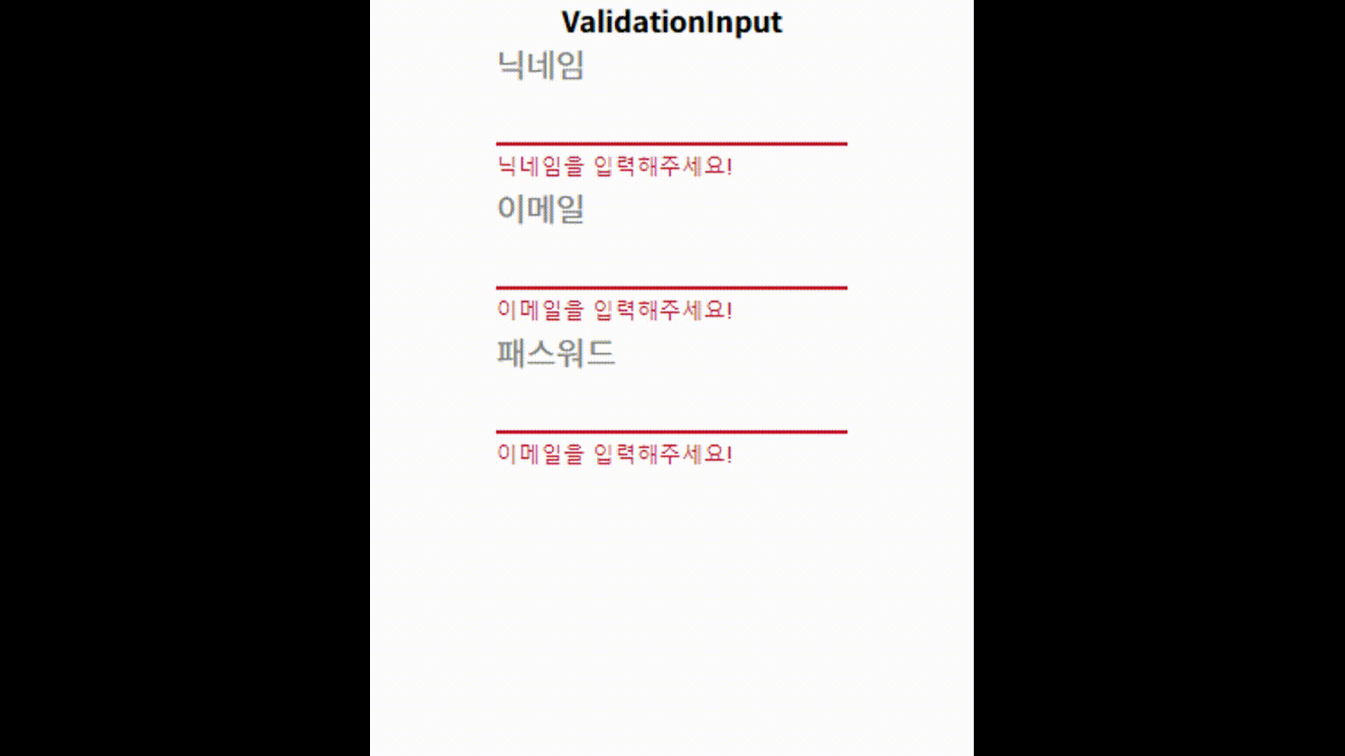
<ValidationInput
label="닉네임"
value={nickInput}
setValue={setNickInput}
maxValue={10}
regexCheck={regex.nickname}
defaultText="닉네임을 입력해주세요!"
successText="통과"
errorText="한글사랑 나라사랑, 3글자 이상!"
/>
<ValidationInput
label="이메일"
value={emailInput}
setValue={setEmailInput}
regexCheck={regex.email}
defaultText="이메일을 입력해주세요!"
successText="통과"
errorText="이메일 양식!"
/>
<ValidationInput
label="패스워드"
type="password"
value={passwordInput}
setValue={setPasswordInput}
regexCheck={regex.password}
maxValue={10}
defaultText="이메일을 입력해주세요!"
successText="통과"
errorText="소문자, 6글자 이상!"
/>
</>
);
};
export default App;
완성
한 번 더 Develop! 🙄
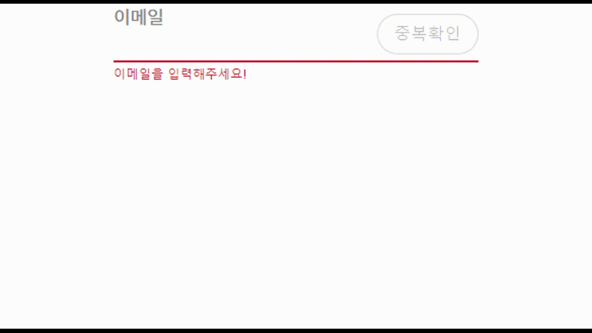
중복확인 버튼을 만들어서 서버랑 통신하는 api를 연결할 수 있게 더 develop을 했다. disabled 속성을 통하여, 중복체크에 통과되지 않으면 버튼이 눌려지지 않도록 했다.
InputComponent
import React, { useState } from "react";
import styled from "@emotion/styled";
import { Button, TextField } from "@mui/material";

//handleValueCheck는 중복확인을 할 수 있는 api함수를 담아주면 됩니다.
//isCheck는 부모로부터 중복확인 여부 state 값을 받아온다.
//setIsCheck는 부모로부터 중복확인 여부 state를 변경시킬 수 있는 함수를 받아온다.
export default function ConfirmValidationInput({
  label,
  type,
  value,
  maxValue,
  setValue,
  regexCheck,
  successText,
  errorText,
  defaultText,
  handleValueCheck,
  isCheck,
  setIsCheck
}) {
  const [isError, setIsError] = useState(true);
  const [isOnCheck, setIsOnCheck] = useState(false); //중복체크를 on 할 것인지 안할것인지 판별 여부
  const [helperText, setHelperText] = useState(defaultText);

  const HandleOnChange = (e) => {
    //한번이라도 수정한 적이 있으면 isWrite를 true로, isCheck를 false 변경시킨다.
    if (isCheck) setIsCheck(false);

    //최대값이 지정되어있으면 value를 저장하지 않는다.
    if (maxValue && maxValue < e.target.value.length) return;

    setValue(e.target.value);

    //공백인 경우 defaultText로 바꾼다.
    if (e.target.value === "") {
      setIsError(true);
      return setHelperText(defaultText);
    }

    if (regexCheck) {
      // 정규표현식체크가 통과되면 successText를 송출하고 아니면 errorText를 송출한다
      if (regexCheck.test(e.target.value)) {
        setIsError(false);
        setIsOnCheck(true);
        return setHelperText(successText);
      }
      if (!regexCheck.test(e.target.value)) {
        setIsError(true);
        setHelperText(errorText);
        setIsOnCheck(false);
      }
    }
  };

  const handleCheck = () => {
    handleValueCheck();
  };

  return (
    <Container>
      <Label>{label}</Label>
      <Input
        error={isError}
        id="standard-error-helper-text"
        helperText={helperText}
        variant="standard"
        type={type}
        onChange={HandleOnChange}
        value={value}
      />
      {isCheck ? (
        <CheckSuccessBnt>확인</CheckSuccessBnt>
      ) : (
        <CheckBnt isOnCheck={isOnCheck} disabled={!isOnCheck ? true : false} onClick={handleCheck}>
          중복확인
        </CheckBnt>
      )}
    </Container>
  );
}

ConfirmValidationInput.defaultProps = {
  type: "text",
  label: "",
  value: "",
  setValue: () => {},
  isCheck: false,
  setIsCheck: () => {},
  handleValueCheck: () => {}
};

const Container = styled.div`
  position: relative;
`;

const Label = styled.span`
  color: #878787;
  font-size: 18px;
`;

const Input = styled(TextField)`
  width: 100%;
  input {
    width: calc(100% - 110px);
  }
`;

const CheckBnt = styled(Button)`
  position: absolute;
  right: 0;
  top: 10px;
  width: 100px;
  height: 40px;
  border: ${({ isOnCheck }) => (isOnCheck ? "1px solid #ff7775;" : "1px solid #d9d9d9")};
  color: ${({ isOnCheck }) => (isOnCheck ? "#FF7775" : "#3C3C3C")};
  font-size: 16px;
  border-radius: 100px;
`;

const CheckSuccessBnt = styled(Button)`
  display: flex;
  align-items: center;
  width: 100px;
  height: 40px;
  position: absolute;
  right: 0;
  top: 10px;
  border: 1px solid #6b95ff;
  font-size: 16px;
  border-radius: 100px;
`;
Parent Component
import React, { useState } from "react";
import styled from "@emotion/styled";
import regex from "../src/Shared/regex";
import ConfirmValidationInput from "../src/Components/Shared/ConfirmValidationInput";

const mypage = () => {
  const [value, setValue] = useState("");
  const [isCheck, setIsCheck] = useState(false);

  return (
    <Container>
      <ConfirmValidationInput
        label="이메일"
        value={value}
        setValue={setValue}
        isCheck={isCheck}
        setIsCheck={setIsCheck}
        handleValueCheck={() => {
          alert("인증완료!");
          setIsCheck(true);
        }}
        regexCheck={regex.email}
        defaultText="이메일을 입력해주세요!"
        successText="통과"
        errorText="이메일 양식!"
      />
    </Container>
  );
};

const Container = styled.div``;

export default mypage;